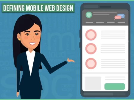
 One of the most important things you can do is create a good user experience for your customers. This not only has to do with your products and services, but it also has to do with your web design.
With this in mind, here are some principles that’ll help you create a great mobile design.
Create a solid hierarchy of information
Mobile users want a web design that’s goal oriented. When they come to your site, they want to quickly find what they need simply by scanning your site.
This means that you need to:
- Be selective about what information you display, providing only that will allow them to complete their task.
- Place your key information and call-to-action buttons front and center.
- Use whitespace and visual aids to separate navigation from content.
Make sure your page is laid out simply
Treat your users’ attention as a precious resource. Therefore your web design should be simple, especially since this works best on small screens. To achieve this, you’ll want to:
- Use one-column layouts. While multicolumn designs work great on desktops when it comes to mobile, multiple columns add a lot of noise that makes it difficult for your visitors to understand the information you’re trying to share with them.
- Never use a horizontal scroll because it fails the Google Mobile-Friendly Test.
- Declutter your layout, so your mobile users don’t become overwhelmed with a lot of information being presented to them all at once. Not only is this confusing, but it also makes it difficult for them to find what they need.
- Take a minimalistic approach to create a clean layout. Use succinct copy without a lot of decorative elements so your users can enjoy a highly-focused mobile experience.
- Remember that each image you use in your web design should bring value to your visitors.
Use large touch targets to ensure that your text is readable
Readability has to do with how easily someone can read and understand the written text on your site. This plays a vital role in web design because you use a lot of text to communicate with your visitors. Here are the properties you should use in your design:
- For the typeface, you should use either Helvetica or Roboto because they scale well and look great on any screen size.
- Use 16 pixels font size.
- When it comes to color contrast, you should strive for WCAG 2.0 level AA so that your text is accessible to all of your visitors.
- Make sure that your buttons are large enough (7 – 10mm) to be tapped by someone’s finger when they’re on mobile. This makes it more comfortable for your visitors to interact with your website.
Minimize the effort it takes your users to input data on your website
Filling out forms isn’t very exciting, which is why you need to design forms that don’t take your visitors a lot of time to fill out. When you’re designing a form, here are a few things you should keep in mind:
- Ask for as little information as possible.
- Offer autofill for fields for things like their address.
- Use inline validation so that your user’s input is validated in real-time. This allows your users to see that they’ve entered some incorrect information before hitting the “Submit” button.
These principles are ones that we use here at the Local SEO Tampa Company in Tampa, FL. We spend time working on your SEO to ensure that you get visitors who see your web design because without visitors, it’s challenging to grow your business. So, when you’re ready to put a strategy together, get in touch with us.
